Stop Calling It Exponential Growth
After 25 years and trillions spent, wind and solar remain less than 3% of global energy, the common retort - "don't worry, their growth is exponential" - is a false narrative.

Start with the number. After twenty-five years and roughly $11 trillion in cumulative global investment, wind and solar together supply about 2.8% of the world’s primary energy (The 2.8% Delusion). Raise that concern and the reply is automatic: ‘you just don’t understand exponential growth.’ A small number compounding at a high rate gets large regardless of where it starts — so the thinking goes — and doubting this trajectory just means you can’t do math.
“Don’t worry, its exponential” leans on two separate claims. The first is simple: the growth rate has to be constant or climbing every year — that's what "exponential" actually means. The second claim is sneakier: declining growth rates (which they are), can be expected of a technology that is approaching market saturation. For this second claim to hold, wind and solar would need to be getting close to whatever ceiling they're capable of reaching at or near 3%. Both claims are verifiable, neither survives the check.
Two charts settle whether the exponential claims are true. Both are built from the same source — IRENA’s Renewable Energy Statistics, the only dataset with consistent global capacity numbers back to 2000 — tracking one thing: the year-over-year growth rate of new solar and wind capacity added worldwide, every year, 2002 through a 2026 estimate.
What “exponential” actually means
Pin the definition down before looking at either chart, because the whole argument turns on it. Exponential growth means a constant — or rising — growth rate. Not constant absolute additions; constant or rising percentage growth, year after year. If solar were genuinely exponential at, say, 30% a year, that 30% wouldn’t fade out — it would repeat: +30%, +30%, +30%, indefinitely, or climb higher.
That gives the two charts below a built-in test. A genuinely exponential process produces a flat or upward-sloping line on a growth-rate chart. A steadily declining growth-rate line — even one that’s still positive, even one that never goes negative — is not exponential. It’s the opposite signature: deceleration, the mathematical fingerprint of a curve past its inflection point, headed toward some limit. Flat or rising growth is exponential. Declining is something else. There is no third category where a falling growth rate still counts as “exponential, but just slower” — falling growth is the definition of not-exponential.
Chart 1: Twenty-five years, no filter
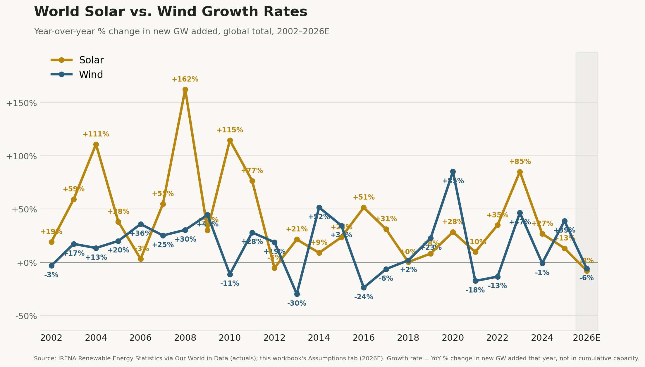
Year-over-year % change in new GW added, global total, 2002–2026E
This is the unfiltered history. It is loud, and it should be — early-market growth rates are always noisy, and both technologies have had genuine boom years as recently as 2023 (solar +85%) and 2025 (wind +39%). By eye alone, you can’t tell from this chart whether the underlying process is exponential or decelerating — there’s too much year-to-year noise to read a trend off it directly. That’s exactly why the test needs Chart 2.
But one thing doesn’t require a trend line to see: a year where both lines are negative at once. Scan all twenty-five years. It happens exactly once — 2026 projected, solar at −8%, wind at −6%. Every other year on this chart, at least one technology was still growing its additions. 2026 is the first time both stalled together.
Chart 2: Strip out the noise
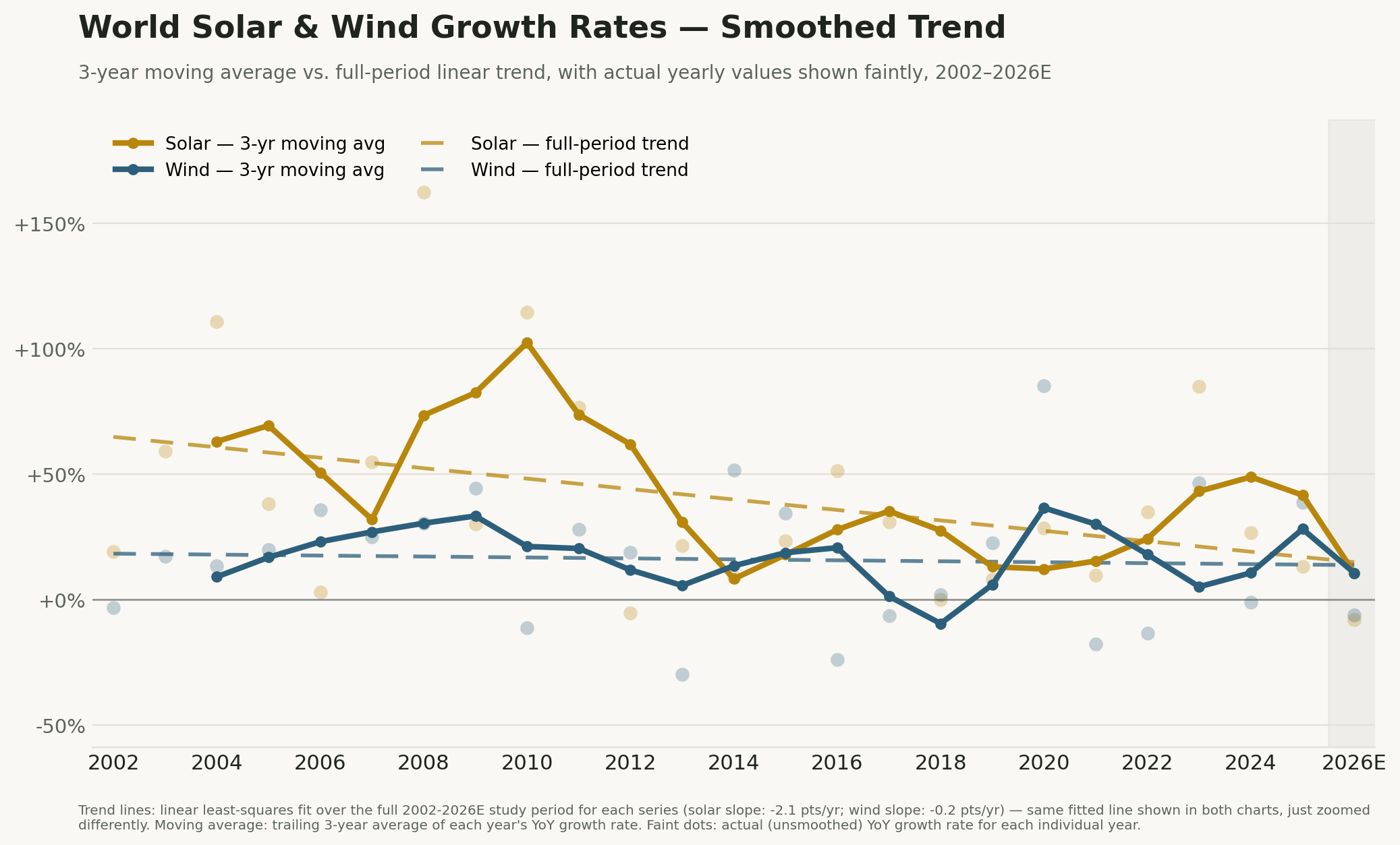
3-year moving average vs. full-period linear trend, with actual yearly values shown faintly, 2002–2026E
Run a 3-year moving average through that same data and fit a single straight line across the full 25-year period for each technology, and the picture stops being noise and becomes a verdict — because this is where the test from the definition above actually gets applied.
A genuinely exponential process produces a flat or upward-sloping line on a growth-rate chart.
Apply the test: is either trend line flat or rising? Nope. Both slope down, across the entire 25-year history, not just recently. By the definition above, that settles it: a line that has been falling for 25 straight years is not the signature of exponential growth. It never was. 2026 didn’t break an exponential trend — there wasn’t one to break. The trend this whole dataset has been tracing since 2002 was already decelerating; 2026 is just the year the math caught up with the rhetoric.
And the smoothed 2026 value doesn’t just meet that already-declining line — it falls slightly below it for both technologies. After running above trend for most of 2021–2025, both smoothed lines land back down at the trend by 2026, arriving right on schedule or a touch ahead of it.
Hold that finding next to the 2.8% figure from the opening. A 25-year decelerating trend would be unremarkable if it were happening at, say, 60% of global energy, with the easy gains already banked and the remaining growth naturally getting harder. It is not happening there. It is happening at 2.8%, with fossil fuels still supplying over 85% of world primary energy. Whatever is causing a quarter-century of deceleration, “running out of places to put more solar panels” is not a candidate explanation at this penetration level.
Why deceleration alone doesn’t end the argument
A slowing growth rate isn’t automatically bad news. Every technology that has ever spread through an economy — electricity, cars, smartphones — decelerates as it approaches saturation, and that deceleration is what success looks like: the addressable market is mostly served.
Are wind and solar, at 2.8% of global primary energy, facing such market saturation? No, there is no plausible technical ceiling anywhere near 2.8%. So if growth is decelerating there, the cause has to be something other than the world running out of room — and 2026 supplies an obvious one: China ended its fixed feed-in tariff in mid-2025 and forced a transition to market pricing depressing demand; the US ended a major residential and grid solar investment tax credits leaving solar to stand alone, now un-subsidized after 25 years; and even mature European grids are now citing curtailment and negative pricing hours as active constraints on further buildout. That last one matters more than it sounds — pouring solar onto a grid that already has plenty of midday solar is like pouring water into a glass that’s already full: each new gigawatt does less than the one before it. Capacity and primary-energy displacement stop being the same curve, and the gap widens exactly as the headline growth rate falls. Two decelerations stacked on top of each other, both showing up at single-digit penetration — nowhere near a ceiling.
Pouring solar onto a grid that already has plenty of midday solar is like pouring water into a glass that’s already full
One exception worth naming rather than burying: European wind capacity additions are forecast to accelerate into 2026, not decelerate — WindEurope’s own number is +31%. That’s real, and it’s evidence this isn’t a uniform global collapse. It’s heavily concentrated in the two markets — China and the US — that built the original “exponential” growth-rate narrative in the first place. A global average can decelerate hard while one region still grows; the average is what the 2.8% figure depends on, and the average is what both charts above are tracking.
The steelman, stated plainly: every major forecaster modeling a 2026 decline also models recovery. BNEF and SolarPower Europe both see new record absolute volumes by 2027–2028, with cumulative global solar capacity more than doubling again by 2030. Taken at face value, 2026 could be a policy-induced air pocket rather than a permanent inflection. Fair enough — but notice what even that generous reading concedes: those same recovery scenarios imply roughly 7% compound annual growth going forward, an order of magnitude below the 32–85% rates this dataset’s own trend line was built on as recently as 2022–2023. Even the bullish case no longer assumes the growth rate the original “exponential” comfort depended on. The argument doesn’t survive its own best defense.
The verdict
Does the retort “don’t worry, it’s exponential” hold? Not as it’s usually deployed, exponential requires the growth rate to be steady or rising. By the definition that opened this essay, a 25-year declining trend line is the textbook signature of the opposite — and that’s what both charts show, not a single bad year but the average shape of the entire dataset, now landing at or just under even its own declining line.
The defensible claim isn’t that wind and solar are finished. It’s narrower, and harder to wave away: the assumption behind the standard reassurance — that the rate itself would keep compounding, making 2.8% irrelevant — has been losing, on average, for a quarter-century, and it’s been losing at a penetration level with no plausible ceiling to blame.
2.8% isn’t a comfortable cushion that buys time for the rate to recover. It’s the level at which a 25-year decelerating trend has nowhere left to hide — too small for “approaching saturation” to explain it, too persistent to call it noise. Twenty-five years and $11 trillion in, sitting at 2.8%, that’s not a rounding error. It’s the argument running out of the one thing it needed to be true.
Appendix: the numbers behind the two charts
What “growth rate” means here, precisely: year-over-year % change in new capacity added that year (GW/year) — the flow, not the cumulative installed base and not generation output. This is the metric the “exponential” claim is actually about; cumulative capacity and total generation both keep rising even while this number goes negative, because a positive but smaller addition still adds to an already-large base.
World solar, selected years (YoY growth in additions): 2023 +85% → 2024 +27% → 2025 +13% → 2026E −8%. Four straight years of deceleration, the last one negative.
World wind, selected years: 2023 +47% → 2024 −1% → 2025 +39% → 2026E −6%. Noisier than solar, but the same destination.
25-year linear trend (the line fit in Chart 2): Solar −2.1 points/year; Wind −0.2 points/year. Both negative across the full study period — the deceleration is the trend’s central tendency, not a deviation from it.
Only simultaneous decline year, 2002–2026E: 2026. Solar was negative once before, in 2012 (−5%); wind has been negative many times (2002, 2010, 2013, 2016, 2017, 2021, 2022, 2024). They have never both been negative in the same year until now.
Source: IRENA, Renewable Energy Statistics, processed via Our World in Data — cumulative installed capacity by country, 2000–2024, with year-over-year additions and growth rates derived from it. 2026E built from published 2026 growth-rate forecasts (SolarPower Europe medium scenario for solar, Wood Mackenzie for wind) applied to this dataset’s own 2025 base, documented cell-by-cell in the companion workbook. Cross-checked against SolarPower Europe’s and GWEC’s independently published rates for the same years (2023 solar: 85% here vs. their stated “85%”; 2025 wind: 39% here vs. GWEC’s “+40%” record year) — rates match closely even where the two organizations’ absolute GW figures differ on methodology.
Compiled June 27, 2026.
Appendix B: the same story, broken out by region
The two charts in the body use the world total, which is what the 2.8%-and-exponential argument is actually about. For readers who want the regional detail behind that total — China, the US, and Europe plotted separately against the world line — the same growth-rate metric, same methodology, same 2002–2026E window:
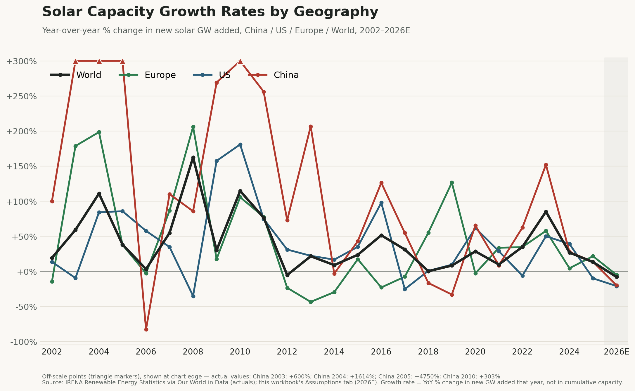
China / US / Europe / World, 2002–2026E
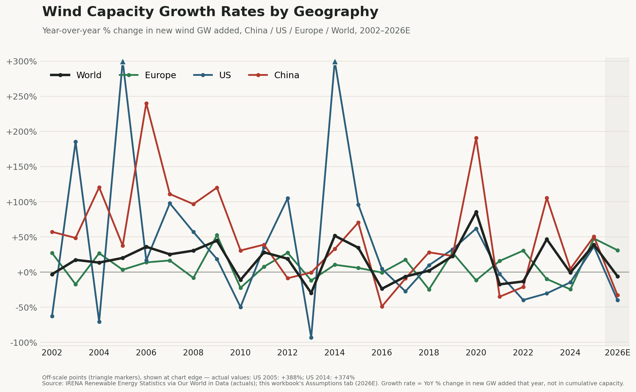
China / US / Europe / World, 2002–2026E
The regional lines are noisier than the world aggregate by construction — single-country annual additions swing harder than a global total, which is exactly why the body of this essay leans on the smoothed world trend rather than any one country’s line. The main regional finding worth flagging on sight: Europe’s wind line is the one that doesn’t fit the global decline story, consistent with the exception named above.
Great article. It sure as hell doesn’t look like exponential growth to me!
None of this matters much, Scott.
All the numbers before last December are artificial because they were skewed by subsidies.
Take away all the subsidies, and watch the decline.
Same with EVs, starting last September.